After a Design Makeover, Mastercard Just Got Really Cool Again
16 July 2018
Text by Jason Nam
Images Courtesy of Pentagram
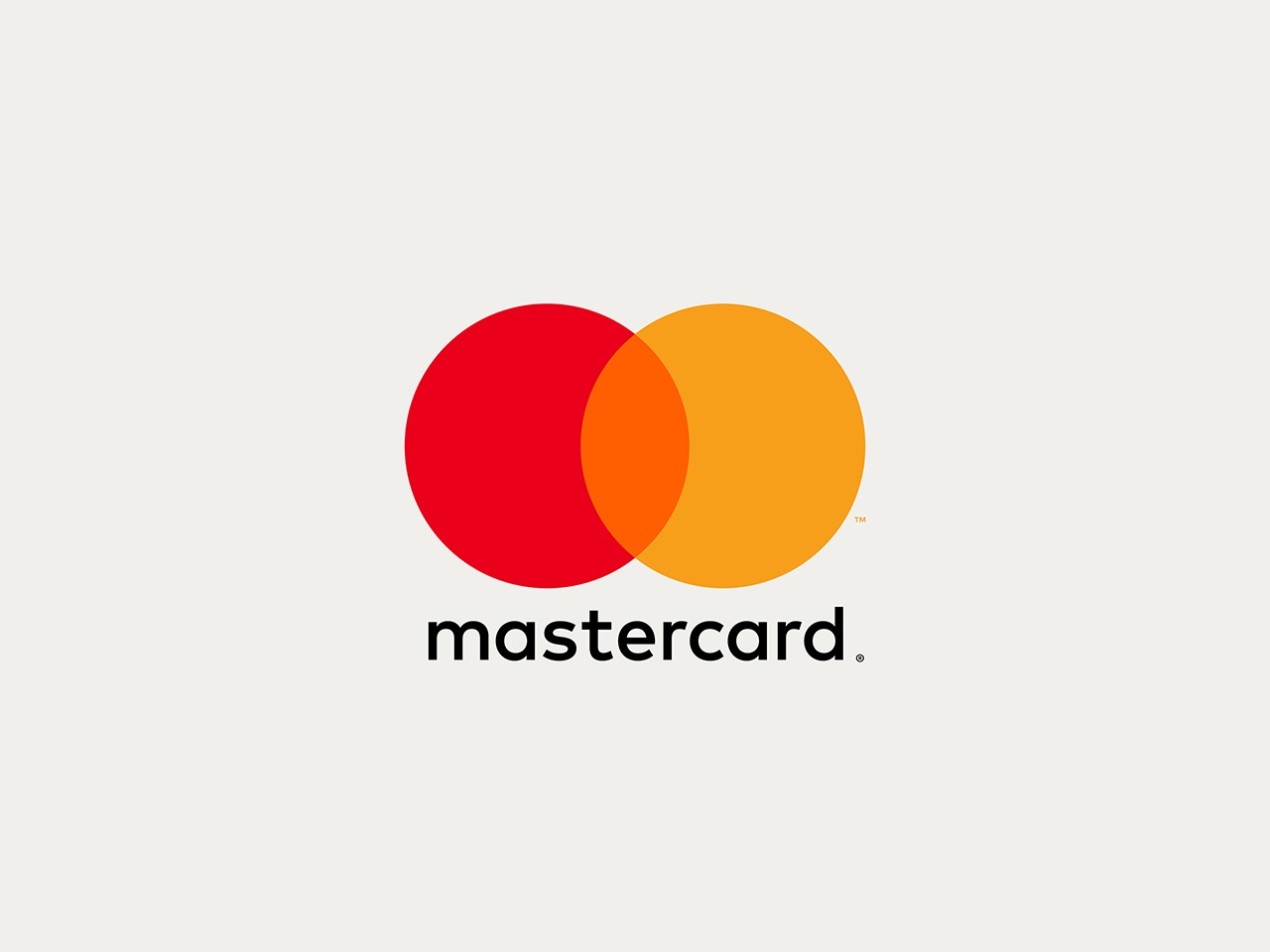
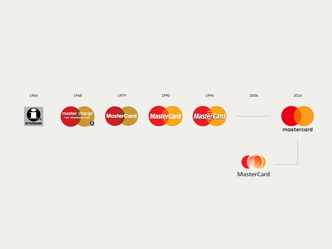
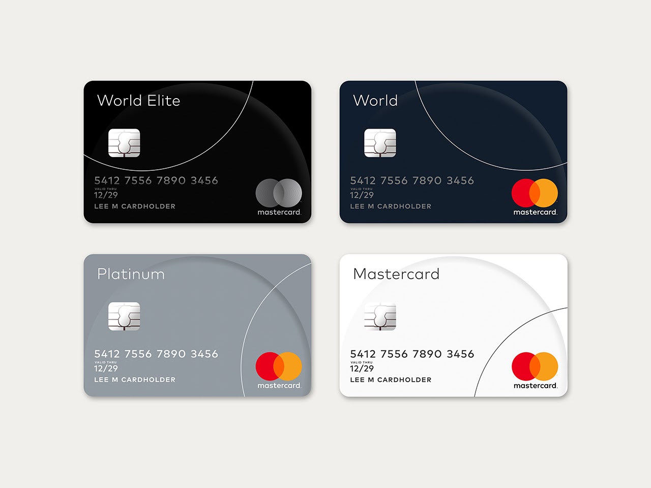
One of the world’s most recognizable logo has been given a makeover for the digital age. Designed by Pentagram, Mastercard’s new simplified logo retains the brand’s distinctive red and yellow circles, but the small modifications give a fresh perspective to the design.
With the new design, gone are the "teeth," the capital letters, and the italic font; reducing Mastercard’s most recognizable assets to their simplest form.
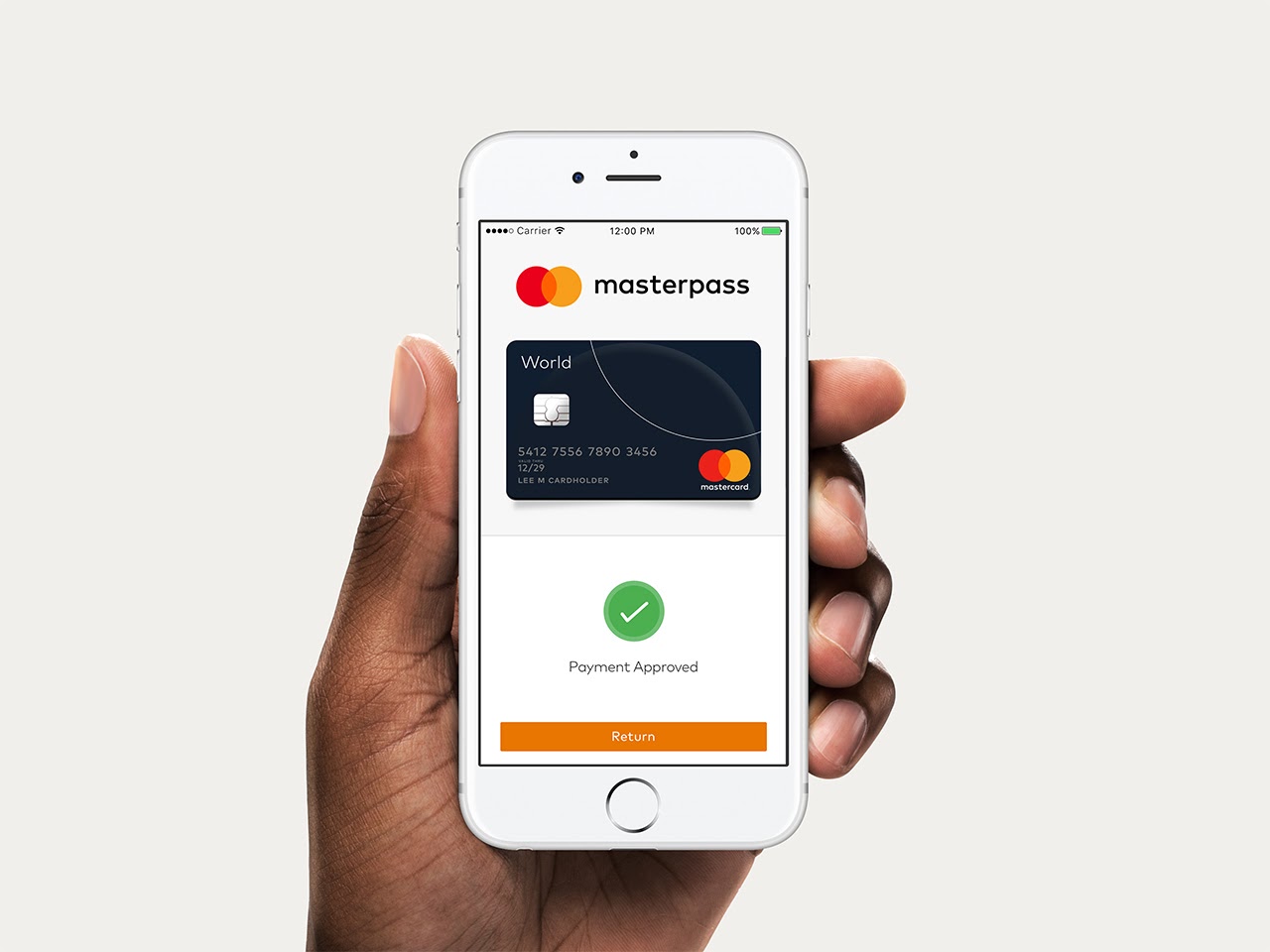
The identity brings simplicity and clarity with an increased emphasis on the interlocking circles, and is optimized for use in digital contexts, an increasingly important part of Mastercard’s business.
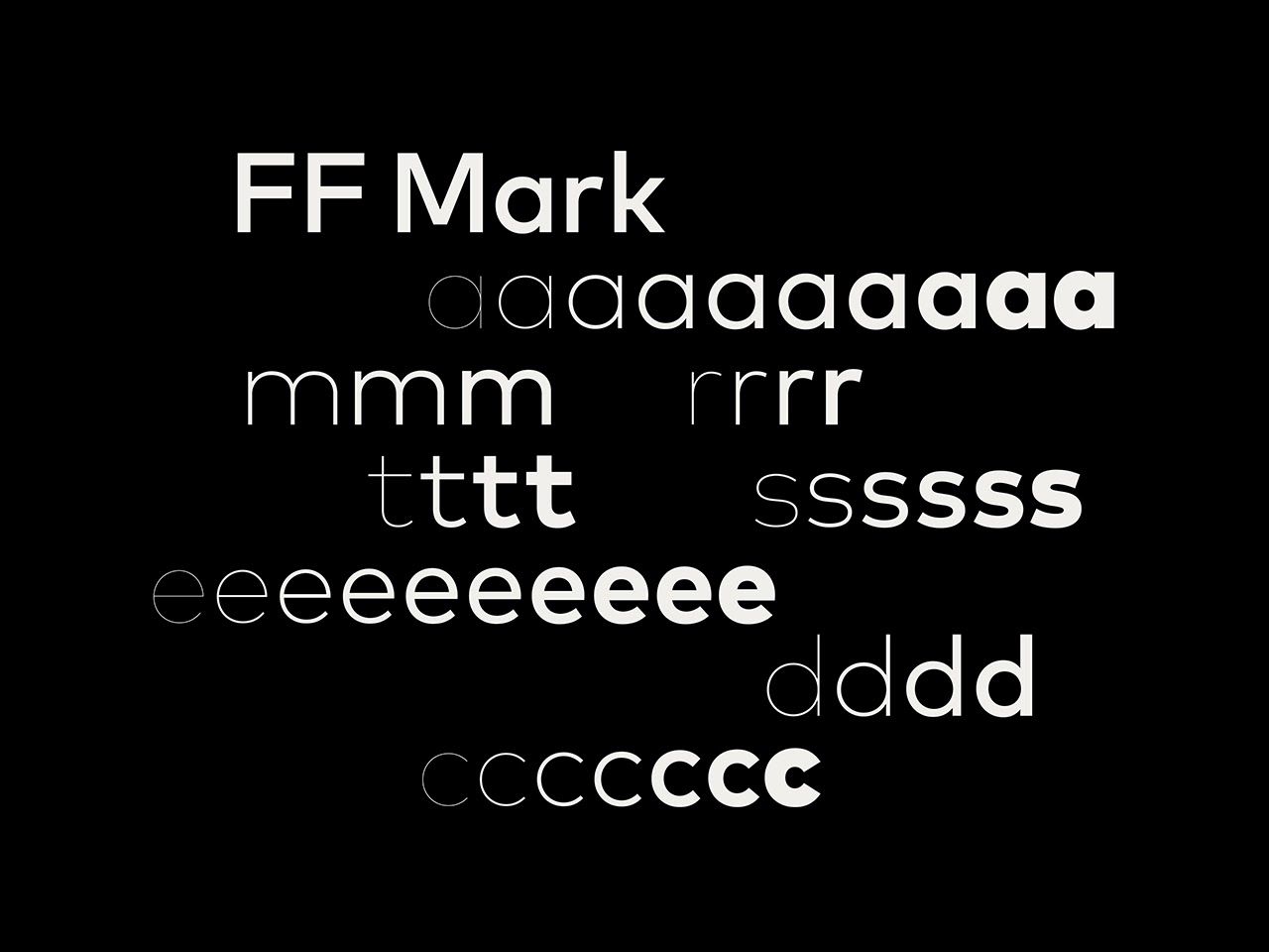
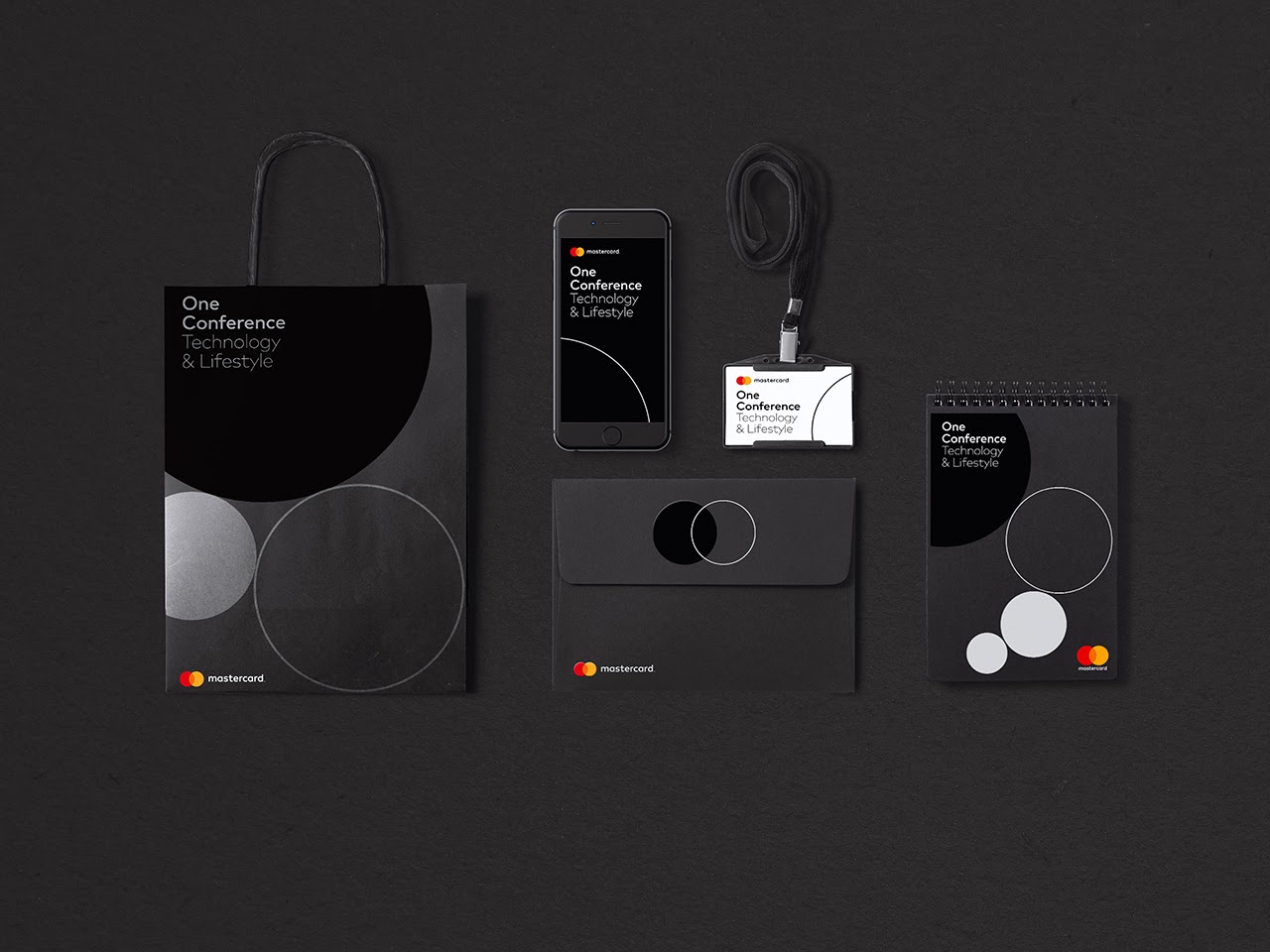
The color palette also got a refresh where black and grey features heavily alongside brighter accent colors. The custom font "FF Mark" was designed by Hannes von Döhren, Christoph Koeberlin and FontFont.
Pentagram partner Michael Bierut says: “I’d like to say the system is really complicated but really, you’ve got two colours, two circles, one word and everything comes out of that. I think it’s excitingly clear and simple in a world that too often presents itself as hopelessly complicated.
There will be lots of groups and agencies working on the rollout so planning for that is in progress, and one of the great things about working with an understood set of visual cues [like the circles] is that while the new logo looks sensational, it doesn’t make the old logo look wrong or unfamiliar.”
What do you think about the refreshed look?


